Responsive Mode
Purpose
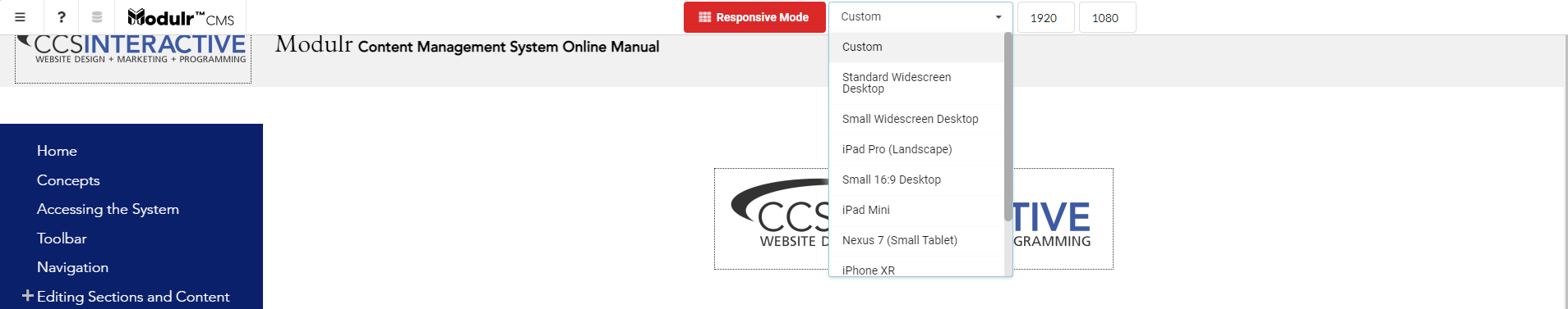
Description and location of Responsive Mode.
The Responsive Mode enables nuanced changes to settings to help improve design and layout for different screen widths.
Once activated, you can choose from various preset devices or customize a screen size. The system will display your website as though it were on that screen size so that you can preview the layout and make changes as desired.
In most cases, you will make changes in Section Settings. There is no limit to how many responsive breakpoints for which you can configure your settings. The system will also automatically optimize your images for the different dimensions that it may encounter at different responsive breakpoints.
You can also manually crop images at different responsive breakpoints for a higher level of control.
How to
- Once in Edit Mode, hover over the toolbar ⇒ select Responsive Mode
- Update accordingly and commit changes ⇒ click Publish Changes when done making edits